
Post Up
Introduction
Post Up is a new startup that focuses on finding great coffee shops and public spaces for freelancers and remote workers. I was brought on board to do a design sprint to quickly test out a possible solution. Through previous research, I came up with designs for the app. The method I used is a modified version of the GV Design Sprint. The sprint is broken up into 5 days.
Project Info
Duration: 5 Days
Key Skills: Ideation, User Flows, Information Architecture, Sketching, Wireframing, Visual Design, Prototyping
Prototype
Explore the Hi-Fidelity prototype,
click below:
Find a place to work, wherever you are.
Design Process
I. Understand
II. Sketch
III. Decide
V. Test
IV. Prototype
Problem Statement
User Insights
Persona
User Map
Lightning Demos
Crazy 8's
Solution Sketch
Storyboard
Hi-Fidelity Prototype
Usability Tests
Problem Statement
At the start of the pandemic, in early 2020, companies quickly converted to the work from home model. There were certain challenges people faced working from home, such as having a distracting environment. It also caused a lack of motivation for people to work, therefore a need for a change in scenery. Post Up wants to help users search for spaces they can work out of besides their home.
Interview question: Tells us about your experience finding a public play to do remote work from.
User Insights
After reviewing the interview here are some highlights:
"I usually need to jump on the computer for a video chat - so I
need to make sure the WiFi is good, and that there isn't too
much background noise around me."
- Andy
"Wifi and bathrooms are the most important thing I look for,
especially if I plan on working there for a full day."
- Jane
"I definitely look for places that aren't too crowded, especially if
I'm trying to get a lot of work done in a short amount of time."
- Evelyn
I. Understanding
Persona
In order to synthesize the research and empathize with users, I created a persona to help find a solution.

User Map
Here is a possible end-to-end experience a user might go through. The user map becomes my guide while I begin to builld the sketches.

II. Sketch
Lightning Demos:
For inspiration, I used Google Maps and Yelp to help curate Post Ups foundation. The two apps had the perfect information set up to make usability easier.
-
One of Google Map’s key features is the ability to see things close by. The feature is great for Post Up since many users look for convenience. It allows users to find a place quickly by navigating the map or using a drop-down list.
-
I also drew inspiration from Google Map's live busy time. Being able to see how busy a place is currently and at certain hours helps users to decide if it is the right place for them or allow them to plan ahead.
-
Another feature that inspired me was Yelp's sort/filter function. This would be a great addition to Post Up's functionality to allow users to find exactly what they looking for, with no more need for trial and error.


Crazy 8's:
The crazy 8's method was used to find possible solutions for the most critical screens. I sketched out a few solutions for the results and location details screens. Users can see everything that is important to them on these screens and find out details about different places they are looking at in order to decide and or plan ahead. I also sketched out the filter screen, because this function is essential to find a place quickly that fits their exact criteria which ultimately saves the user's time.

Solution Sketch:
From the Crazy 8's sketch, I put together a 3-panel board that best represents the overall flow and look of the app features.
The solution sketch acts as a mini storyboard of how the users will interact with the app. The user begins by searching for what kind of places they are looking for (left panel). Then, users will be able to see the search results and select a location (center panel). Last, they will the details of that location (right panel).

III. Decide
Storyboard
I created a 10-panel storyboard that serves as a lightweight sketched wireframe that becomes my foundation for building my prototype. The storyboard shows the user's flow from start to finish in finding a place to work remotely. Based on the feedback I received, some elements were added and taken out as I continued to work towards my prototype.

IV. Prototype
Hi-Fidelity Frames
After receiving feedback and feeling comfortable with my design on paper, I moved on to the hi-fidelity screens and created a prototype.
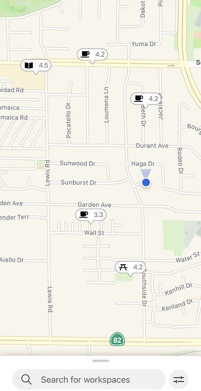
Around You
From the landing page, users are able to swipe up and see places around them. This allows users to quickly find close-by locations effortlessly. During the interviews, many interviewees expressed that sometimes they just want to find whatever is close by.
Filter
Having the added feature of a filter takes away the stress of having to read through location details and skimming through multiple locations. Users can easily find exactly what they want.
Location Detail
Everything you need to know is now all in one place. Users are able to see what the location offers and how crowded it gets during certain hours. This makes determining noise level and planning ahead a breeze.
Share ETA
Having the ability to share ETA allows users to plan thoroughly and makes meeting up hassle-free. There is no more need to guess arrival time and the other party can plan accordingly.


V. Test
Usability Testing
There were five participants that tested the prototype. Three were given a few tasks to complete. The other two were given free rein to explore the app for first impressions and feedback.
Key findings during the tests:
-
100% of the participants were able to complete the tasks given at hand
- Task:
-
Search for coffee shops
-
Look for coffee shops that have free wifi and outlets
-
Get directions to the coffee shop
-
End the navigation
-
- Task:
First Impressions:
-
The app is straightforward and has great features
-
It is easy to find a place and plan ahead
-
The design is intuitive since it is streamlined
Feedback:
-
Participants liked that they were able to see how busy it is in the location details
-
Participants suggested having categorized photos to see indoor and outdoor seating
Conclusion
Next Steps
Design Rework
Given that this was a 5-day sprint, I would have loved to continue to rework the design and have a smoother prototype. A prototype with better animations and transitions. I would also have loved to experiment and create different solutions while doing A/B testing to receive more feedback.
Lessons Learned
-
Time management and quick brainstorming. Running through this 5-day design sprint helped me to learn to generate a lot of different ideas without overthinking. I find that it is easy to get stuck on one idea and the Crazy 8's method helped to experiment with different possibilities. It also helped to manage my time since it is a quick brainstorming activity. This helped to not get tunnel vision and be open to experimentation.
-
This design sprint also helped me to think critically. Having only a day to do each step taught me to think critically about my solution and the decisions I made throughout the process. This helped me learn to synthesize information quickly and really think about what is really important.